The basic steps of the graphing procedure:
They warm up by placing 5 key points inside a box, any box, like this, eyeballing it so that the 2nd, 3rd, and 4th points are halfway between everything else vertically and horizontally:
 |
| 5 key points |
 |
| One cycle of the cosine function |
So next, they calculate the correct locations of the box's corners on the cartesian graph. This is about 25 slides condensed into two:
 |
| Use max and min to get top and bottom of box |
 |
| Use phase shift and period to get left and right ends of box |

This makes it pretty easy to repeat and draw as many cycles as they want:

Of course we then extend to the sine curve, and then to using a regular x-axis, as opposed to one with all those π's all over it.
So how did this go into the cloud?
First I put the above procedure on a voicethread, which they were to watch at home. Then I put some practice examples onto a googledocs drawing, like this. Next day, in class, I gave the students the link, did a quick demo of two tools: the rectangle tool, and the scribble line tool, and we were off to the races.
So how well does it work?
As usual, my answer is...........it depends. If you measure the success by how much fun they had and how engaged they were, it was pretty successful. Lots of laughs (or lols) at how wobbly some curves were! I was also able to correct some mistakes right off the bat because I could see what they were doing as they were doing it, so as an intervention, it was also successful. As a collaborative activity, it was so-so, for as usual I decided who would work with whom. As a pure practice activity, not bad, only had time to do two functions, and I had prepared 4. I'm pretty sure the slowness was not because of the tech, though, it was more about them being at the beginning of their trig curve-learning curve.
And the graphs? Well, I believe in full transparency, so here's their work, warts and all, (just a figure of speech, I think they are gorgeous)::


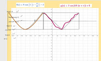
I thought they were pretty terrific, in fact, quite consistent, all things considered. I displayed them the next day to each group so they could compare, and it was interesting to hear the reactions. Some were impressed with how smooth some people were able to get their curves. One group's curves were a little too perfect, actually:

But they had found a way to follow the procedure AND improve on it! They had done their calculations and drawn the box, but found that by using the curve line tool instead of the scribbler, and hitting only the max and min, the curve automatically went through all 5 key points, and it looked beautiful! Which suggests to me that there must be some trig involved in the curve line tool.....so I learned something too!
A few organizational details:
- When creating the practice activity, I went with the google drawing because I couldn't find the scribble tool on any other type of googledoc, but now I see that it's there in "Presentation" too.
- I didn't have everyone working on one google drawing at the same time, because it tends to be too slow with that many people. I made a few copies and split the kinds into groups of 2 or 3.
- Each of the copies' file names contained the names of the kids in that group, to help me keep the picture in my head of who was working with whom. I need a lot of help, what can I say.
- When sharing, I set it so that everyone with the link could edit it, otherwise no one would be able to draw!
- Since they were all still in the virtual class during all this, I put them into breakout rooms according to their groups, so that I could talk to one group at a time if needed.
- I had them write their calculations on the classroom whiteboard instead of the google drawing. The scribbler is just terrible for writing. That also kept their graphs relatively clean.
- While they were working, I was able to click from tab to tab and quickly know which group I was looking at because of the names in the file title.
Next time:
- I'd like to add some suspense to it - maybe they are initially working on individual cycles, but they get stuck together so that in the end, if everyone has done it right, we get a nice long graph with lots of nice smooth sort-of-identical peaks and troughs. Everyone contributes to it, but only at the end.
- More examples, and widely varying box sizes, just for fun. One really tall, skinny one, and one that is the width of the entire google drawing!
No comments:
Post a Comment